Creating a multi-themed, tokenised design system
I led the architectural overhaul of a multi-brand design system serving Gen Z students, universities and employers. My focus was the scalable foundations, the semantic tokens, UX patterns, skeleton layouts, audience theming and white labelling, built so anyone could pick the system up and intuitively stay on brand. I partnered closely with front end engineering so our Figma libraries were mirrored exactly in Storybook.
At a quick glance
- 79% Engineering velocity
- 65% UI related QA tickets
- 6hrs Saved per designer, weekly
- 40% Faster sprint planning
The problem
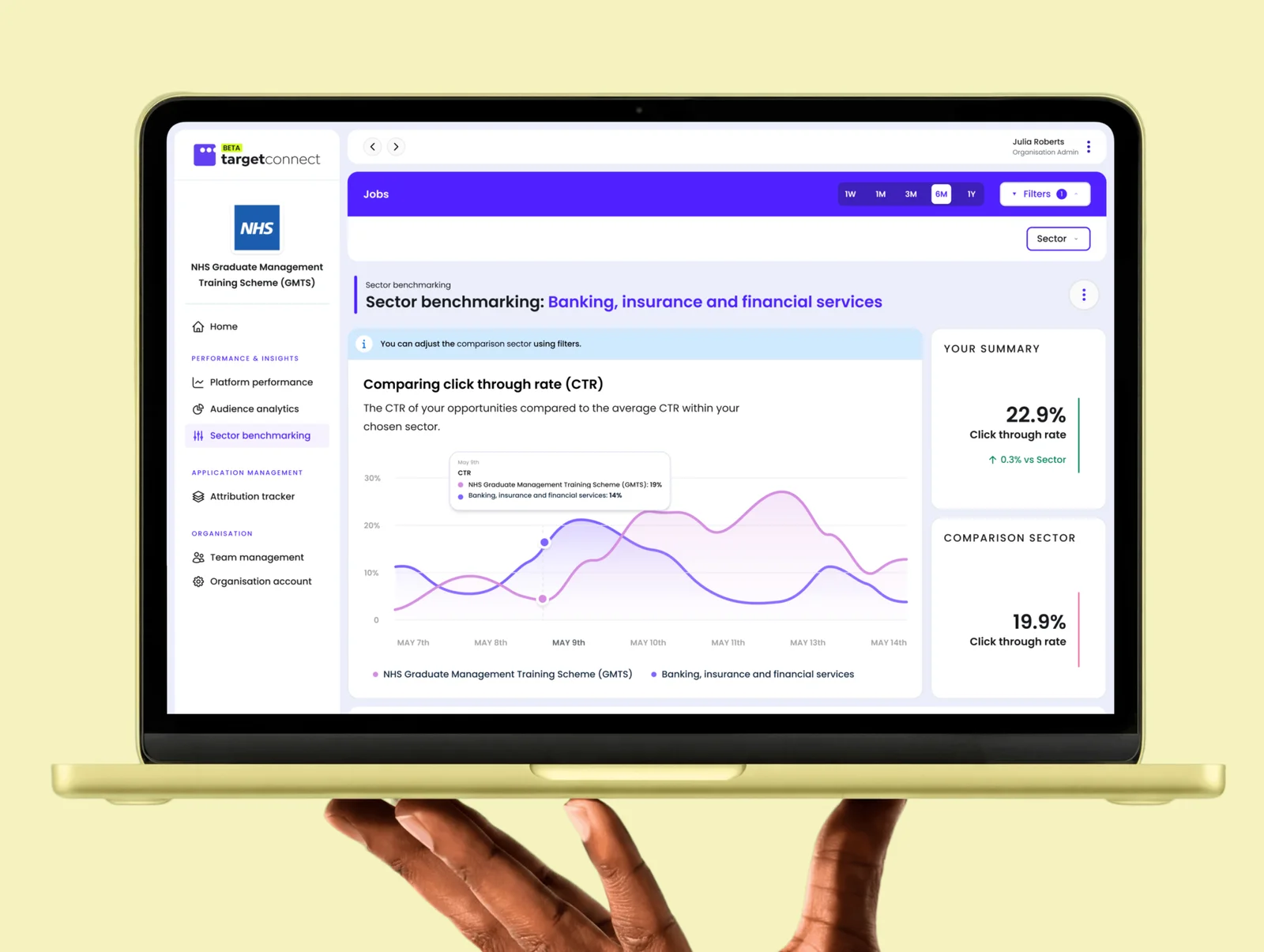
Ten products, three audiences, and a static UI kit that couldn’t keep up
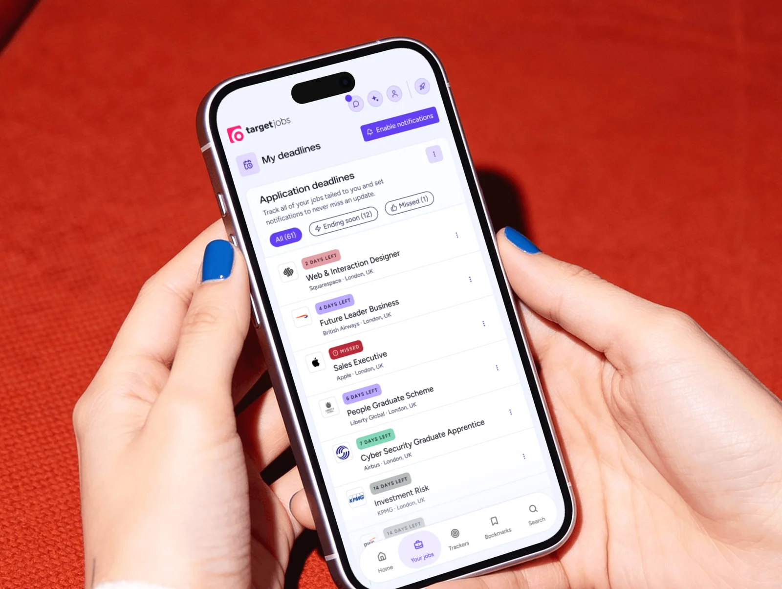
Students, universities, and employers demand genuinely different experiences from the exact same underlying products. We needed spacious, simple interfaces on one side and dense, complex data views on the other. Our static UI kit treated them as a single audience, which caused inconsistency. Product teams kept rebuilding the same patterns and near identical components, causing friction between design and engineering and slowing delivery.
The component set itself wasn’t the issue. The foundations were. Colour and spacing were set per product, so nothing could be re-themed without meticulous manual overrides.
To get buy in from my boss and other senior stakeholders, I pitched what a scalable system could unlock rather than framing it as design cleanup. I built the case around machine readability, showing them how they could drop a fully tokenised library into AI tools and generate on brand concepts in minutes. That reframed the work from a visual coat of paint into a change in how we would build for years. It landed.
The solution
Rebuilding the foundations instead of the library
Our aim was to rebuild the underlying architecture, not redesign the component library. We benchmarked established systems like Material Design and Atlassian, but deliberately avoided a copy and paste implementation because we wanted it tailored to our own needs.
We migrated our existing components rather than redesigning them from scratch. The visual layer was good, so we kept scope on the broken structural foundations. Teams didn’t have to relearn a UI they already knew, which let us roll the system out product by product instead of a high risk overhaul. The system now matters as much to stakeholders as it does to designers and engineers.
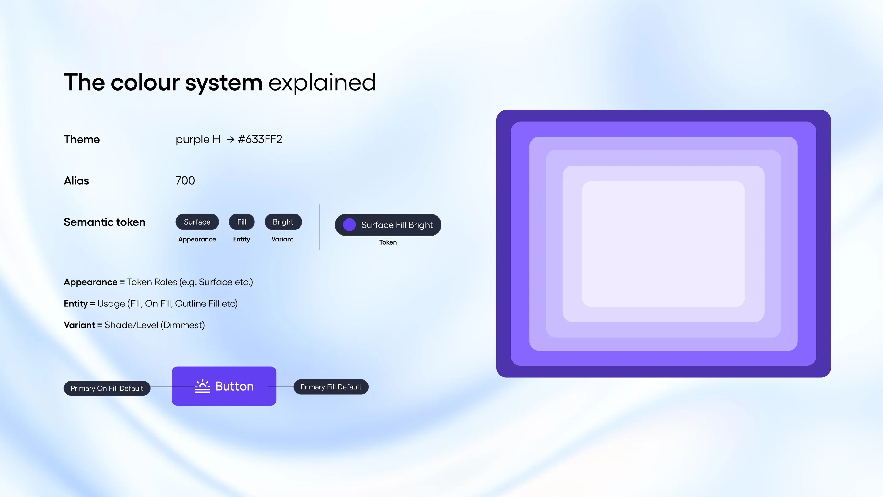
Tokens named by function, not by colour.
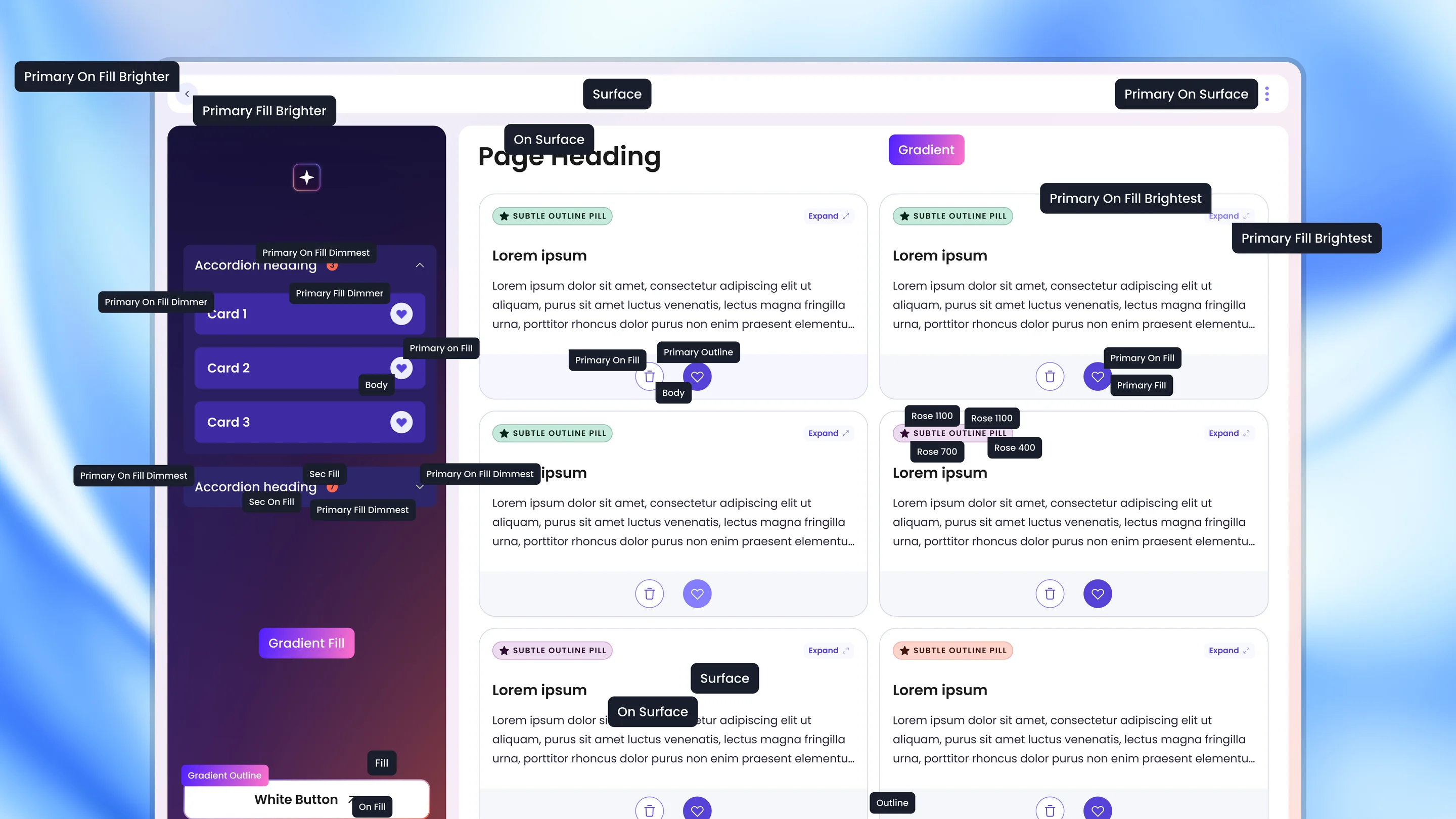
The core of the architecture is a strict Surface / On-Surface pairing logic. Every foreground element is tied to its container, which passes at least AA contrast rather than leaving it to QA. As the pairings are linked at the token level, we can swap entire themes or brands without manual work.
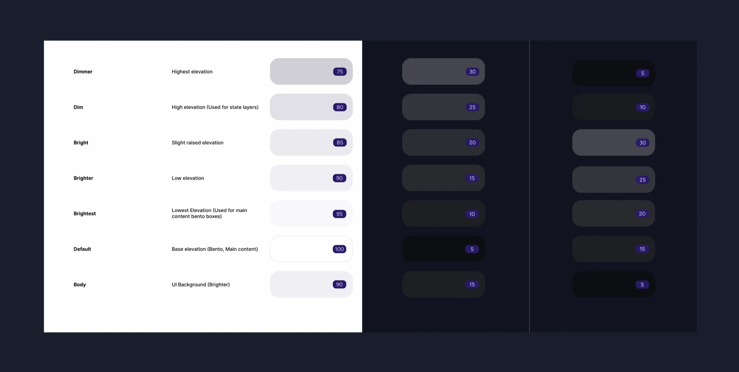
Luminance and density over light and dark.
I dropped the traditional light and dark naming in favour of luminance based modes, so the same names hold whichever theme is active. I also introduced density tokens for compact and spacious layouts. That combination lets one system serve three audiences. Professional operators get high density data views, students get spacious simplicity, and neither audience is forced into a one size fits all compromise.
Getting the whole team fluent in the system
Throughout the project I worked with the front end tech lead, so that as designers migrated components in Figma, developers mirrored them in Storybook through tight feedback loops. To make the logic stick rather than sit in documentation, I ran hands on workshops where the team mapped tokens to low fidelity layouts with pencil and paper. I also set a challenge where I stripped a UI of all colour and handed the team only the foundational rules, to see if they could map the right tokens back. It built fluency faster than documentation ever could, and support requests dropped off sharply. It also cut the time spent in refinement, so the team could focus on real problems instead of debating which component to use.
Solving the white label colour crisis
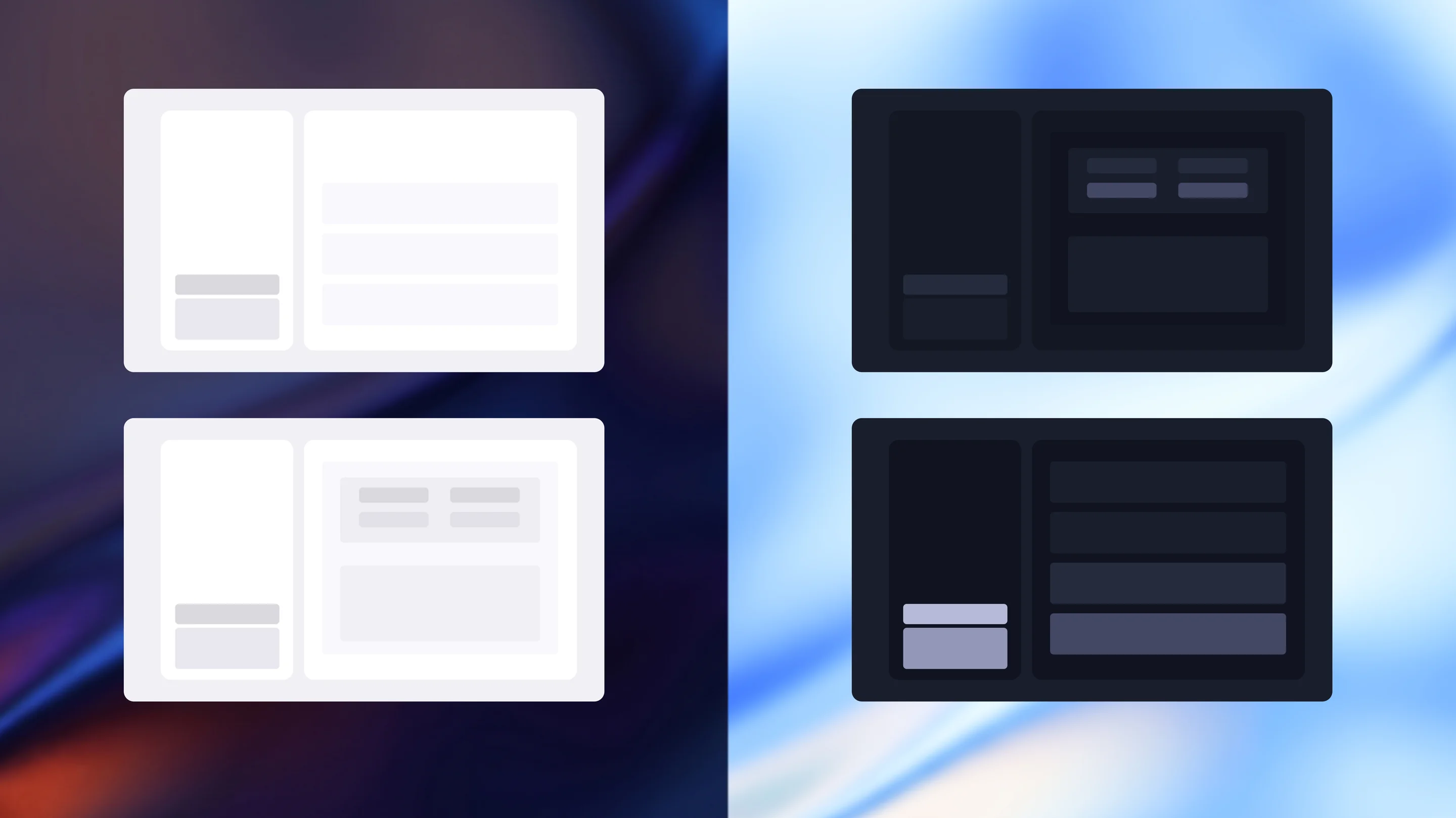
True white labelling was one of the hardest constraints we faced. The system had to absorb any university’s brand palette without breaking the UI. At first we tinted our base surface colours to match the client’s brand, the common industry approach.
Stress testing extreme brand colours exposed a flaw in that model. If a university’s primary brand colour was a vibrant yellow, injecting a yellow tint into the background surfaces made the whole product look muddy.
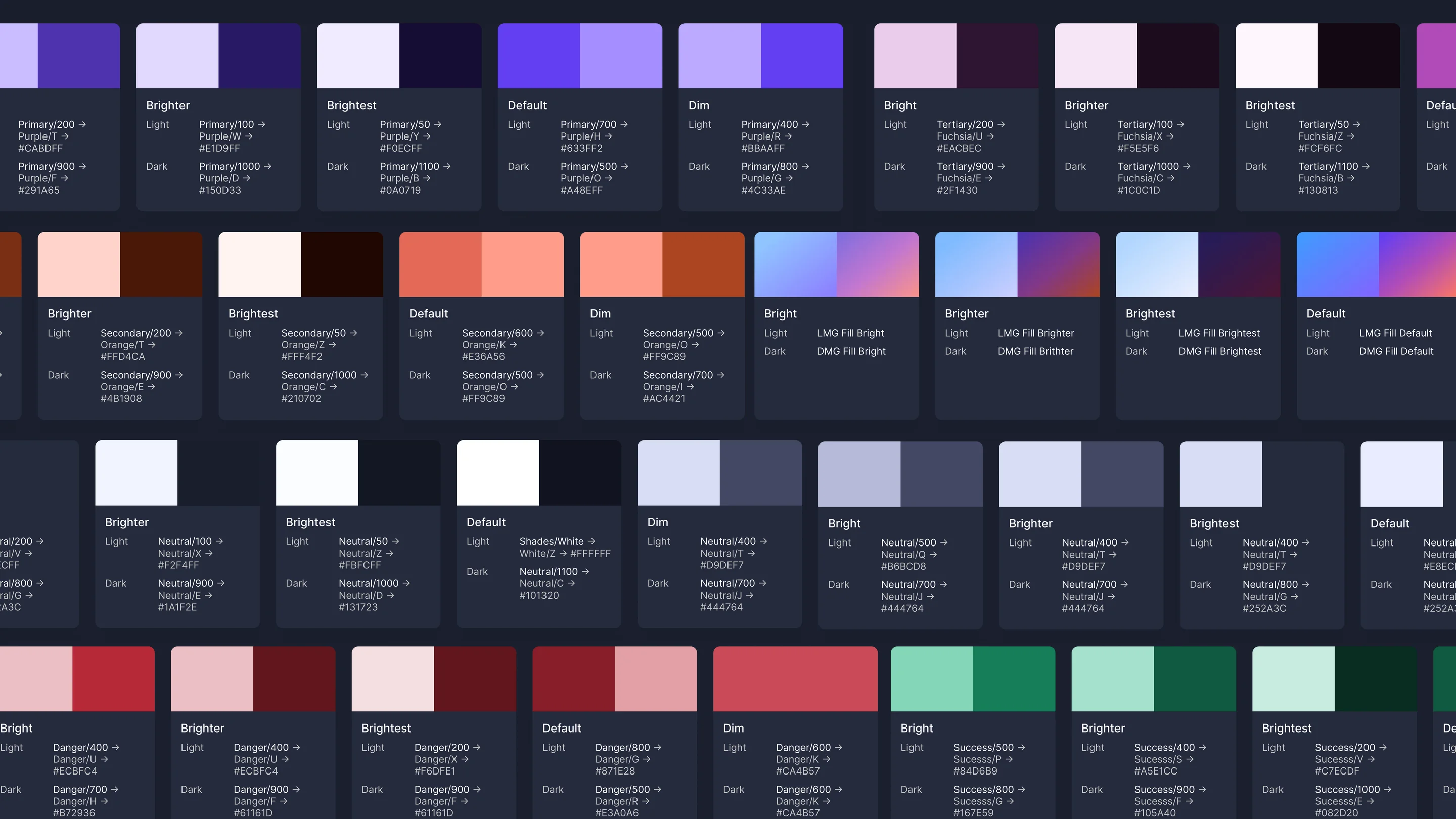
The fix was to decouple them. I locked all background surfaces and structural elements to a shared, neutral palette across every theme, and restricted brand expression to the Primary, Secondary, and Tertiary tokens. Semantic colours like success, warning, and error stayed decoupled from the brand themes, so established UX patterns held. A client could then throw any hex code at the system and the UI would take on their brand without compromising legibility or recognition.
Before this, building a branded product for a client pitch was a manual job. Now designers and engineers can spin up a fully white labelled environment in minutes by swapping the core brand tokens. That changed how we pitch, putting customised, high fidelity demos in front of clients on demand and freeing the team from the manual grind.
The outcome
Less noise, more design, happy teams
Developers now assemble high fidelity pages straight from the library, which frees the design team for the harder UX problems. Visual drift has reduced massively. As the tokens are machine readable, they act as a guardrail when stakeholders iterate in generative AI tools, so concepts come back on brand by default and there is far less back and forth.
The most important change was moving from a design review handoff culture to a synchronised workflow. We stopped treating the design system as a static sticker sheet and started treating it as a product in its own right, keeping component updates, Figma variables and code parity in sync. The real measure of success is the drop in noise. No more Jira tickets arguing about alignment, no more manual visual QA, and product designers finally spending their time iterating on UX rather than inspecting UI.